Lisci
Lisci is a product that aims to revolutionize the way life science companies approach the management, storage and outsourcing of their knowledge, as well as the training and development of their employees.
My Role
Shaping the overall product and UX visions.
Developing the brand identity from initial concepts to final execution.
Designing the MVP’s UI/UX in collaboration with the product team.
Summary
The goal of the project is to create a company-wide social platform that fosters learning, sharing and retaining knowledge through an engaging experience and meaningful interactions with content and other users. The platform will become more useful the longer it is used, over time becoming a company’s memory.
THE PROCESS
Initial Research and Hypothesis Formation
We started with targeted research to pinpoint the primary needs in knowledge management and employee training within the life sciences sector. From this, we developed foundational hypotheses to guide the design and functionality of Lisci.
Prototype Development
Two key prototypes were crafted:
Vision Prototype: A high-fidelity prototype showcasing Lisci’s full potential, designed to capture investor interest and validate our overarching concept.
MVP Prototype: This basic feature set prototype was developed for quick real-world testing with actual users, allowing for rapid iteration based on practical feedback.
Minimum Viable Brand (MVB)
Simultaneously, we developed an initial brand identity—our Minimum Viable Brand—to align our market presence with Lisci’s vision from the start.
OUR HYPOTHESES ON THE FUTURE OF LEARNING
Flexibility
Where do you learn best? At a desk, in a cafe, or during a train ride? Learning platforms need to be as flexible as modern lifestyles, enabling users to access courses and resources on their schedule, wherever they are.
Saving Knowledge
When an employee moves on, their insights and experiences could vanish unless captured. A robust platform should make it simple to preserve this intellectual capital and integrate it seamlessly for ongoing access by all.
Learning Is Social
Interaction boosts retention and enjoyment. A platform that offers community features, like forums or group challenges, taps into the social nature of learning, making it a shared and supported experience.
Learning Is Interactive
True learning involves more than just reading or watching. It should be an active process with opportunities to engage with the material through interactive tasks that reinforce understanding and application.
Learning Is Multimedial
Just as streaming services provide a rich mix of media to suit any mood or preference, educational platforms should embrace everything from text and videos to interactive simulations. This variety ensures that every type of learner finds something that resonates, making education not just effective but enjoyable.
UNDERSTAND – REMEMBER – APPLY
The Vision Comes Alive
The vision prototype is the first materialisation of our design goals. We developed it in close cooperation with the lisci content stream. After our first concepts of how we elaborated the future of learning, we merged and further developed our ideas

UX PRINCIPLE #1
Engagement
Engagement is crucial. Our design minimizes UI complexity to focus users on interacting meaningfully with content and peers. The environment is crafted to be positive and inviting, encouraging users to explore and engage with the learning materials actively.


UX PRINCIPLE #2
Guidance
Effective guidance is key. We provide intuitive feature tours and use illustrative dummy content to help users understand and utilize the platform effectively. This support extends beyond basic instructions, encouraging note-taking, knowledge sharing, and interactive learning.


UX PRINCIPLE #3
Community
Our platform recognizes that learning is a communal activity. We’ve integrated features that foster interaction, such as comment functions, and plan to expand these to enhance the social learning experience. This community aspect is fundamental to the user’s growth and engagement.

UX PRINCIPLE #4
Legibility & Structure
Visual clarity and readability are paramount. We use legible typography, optimal line lengths, and muted color tones to reduce eye strain and improve focus. Our design uses a structured, narrative approach, making information digestible and engaging through storytelling elements.

MVP DESIGN
Proof of Concept
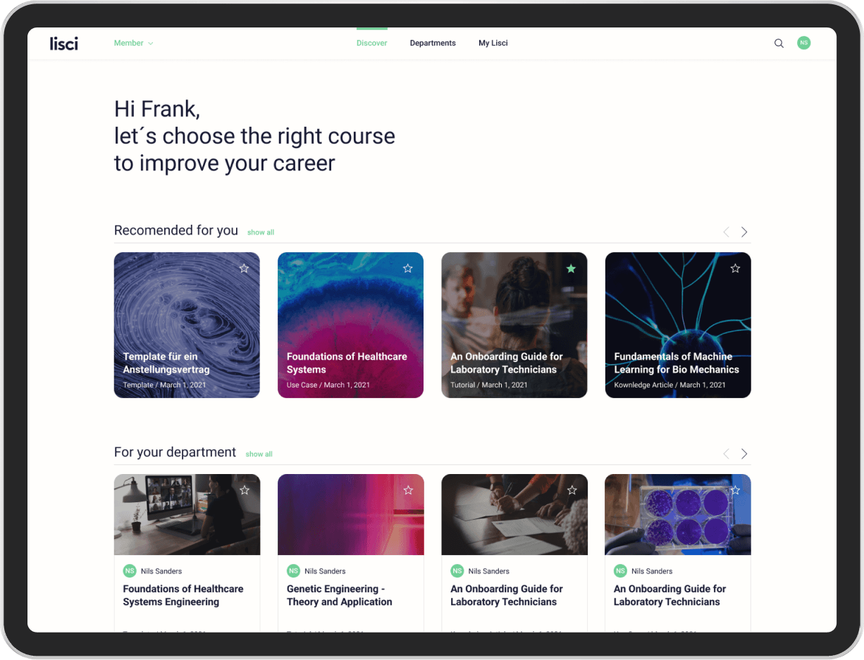
We designed the first functional version to learn from user feedback as quickly as possible. Our goal for the MVP version was to give a first outlook of the modern (open, transparent and minimalistic) design approach. In the course of the MVP we have developed a UI Components Design System. The goal: everything is geared to speed and fast development and at the same time flexible and open for future elements.Together with the product and development department we defined the user flows in several workshops, which were the basis for our first prototype click dummy followed by the MVP.


MVB – MINIMUM VIABLE BRAND
Branding Process
We began by evaluating the existing Lisci brand elements established in the early stages, optimizing key attributes like the logo, typography, and colors. A thorough competitive analysis and a review of our product vision revealed the need for a comprehensive brand overhaul to better align with our strategic goals and appeal to both end-users and decision-makers.


We explored four different branding approaches, narrowing it down to two after consulting with our advisory board. These selected directions are currently being refined through collaborative workshops with stakeholders to further develop our brand’s personality and visual language.

Next Case Study